Read Time: 10 min
You inherited a solid cherry dresser, and its warm reddish-brown color has deepened over decades. Now you’re shopping for a new bed, and the dark chocolate brown of American black walnut catches your eye. Standing in your bedroom, doubt creeps in: will a walnut bed next to that cherry dresser look mismatched?
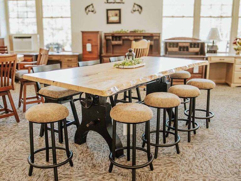
Mixing wood tones is less of a gamble than it looks. Buying every piece in a room from a single matched set tends to create a flat, catalog-like feel, while combining solid hardwoods like oak, cherry, maple, and walnut adds depth and a layered, collected look.
Once you understand three woodworker’s rules (undertone, grain texture, and deliberate contrast), mixing wood furniture becomes a reliable formula. This guide walks through each rule, the mistakes to avoid, and room-by-room pairings that work.
TL;DR / Quick Summary
Mixing wood tones works when you keep undertones in harmony, balance bold and quiet grain, and contrast species on purpose instead of chasing a near-match.
Key Takeaways:
- Identify each wood’s undertone (warm, neutral, or cool) before you shop.
- Let one dominant wood cover roughly 60% of the room’s visible wood.
- Balance open-grain oak with closed-grain maple or cherry.
- Skip near-miss stain matches; clear contrast like walnut and maple reads as intentional.
- Repeat every secondary wood in at least two places in the room.
Wood Undertones: Why Woods Clash or Complement
The most important factor when mixing wood tones is undertone, the underlying color temperature of the wood, not how light or dark it looks. The four hardwoods we build with fall along a spectrum from warm to cool:
- Warm (red, orange, golden): Black cherry has a reddish to amber-brown undertone that deepens noticeably with light exposure. Red oak carries a warm tan to reddish-pink cast.
- Neutral (cream, tan, straw): Hard maple is pale cream with a subtle warm hint that mellows toward amber over time. White oak runs light to medium tan-brown, sometimes with a faint olive cast, and reads as neutral in most rooms.
- Neutral to cool (cocoa, espresso): American black walnut ranges from medium to deep chocolate brown. According to The Wood Database, walnut can show gray, purple, or reddish casts, and in most furniture it reads as a deep neutral rather than a warm tone.
| Warm | Neutral | Neutral to Cool |
| Black cherry | Hard maple | American black walnut |
| Red oak | White oak | — |
When two wood pieces clash, competing color temperatures are almost always the cause. A honey-orange stained oak table beside a gray-washed dresser, for example, forces the eye to read warm and cool at the same time.
Walnut and cherry, on the other hand, work well together. Walnut’s deep, neutral brown acts as a grounding foil for cherry’s warm glow. Before you add a new piece, look at your existing furniture in indirect daylight to identify its baseline undertone.
Pick a Dominant Wood Tone, Then Contrast on Purpose

A cohesive room needs a clear hierarchy. A useful rule of thumb, borrowed from the 60-30-10 approach designers use for color, is to let one dominant wood claim about 60% of the visible wood surfaces, a secondary wood about 30%, and an accent wood the remaining 10%.
| Dominant (~60%) | Secondary (~30%) | Accent (~10%) |
| Dining table, bed, or floors | Chairs, dresser, nightstands | Frames, mirrors, small tables |
In a dining room, the dominant piece is usually the table, whether that’s a farm table or a pedestal table. In a bedroom, it’s typically the bed. Hardwood floors count too, which is why they come up again in the mistakes section below.
Avoid the Near-Miss Trap
The most common mistake is hunting for a new wood that almost matches an existing piece. Staining an oak table to resemble a vintage cherry hutch usually produces an awkward near-miss that looks like an oversight rather than a choice.
Contrast on purpose instead. If your primary wood is pale hard maple, pair it with rich black walnut. The eye reads a clear difference in color value as a deliberate design decision.
Follow the Rule of Two
Whenever you introduce a secondary or accent wood, feature it at least twice. A single walnut end table in an oak-dominated room can look stranded.
Add a walnut-framed mirror or a pair of walnut picture frames across the room, and the eye connects the pieces into a balanced whole.
Grain Texture Matters as Much as Color
Color is only half the equation. Grain structure, meaning the size of a wood’s pores and the pattern of its growth rings, sets a room’s visual and tactile weight.
| Wood Species | Grain Structure | Visual Weight |
| Red & white oak | Open, prominent | Bold, textured, traditional |
| Black walnut | Semi-open, flowing | Rich, organic, refined |
| Hard maple | Closed, tight, uniform | Clean, subtle, modern |
| Black cherry | Closed, fine, satiny | Smooth, formal, delicate |
- Open-grain woods: Red and white oak have visible pores and distinct growth rings. Flat-sawn oak shows cathedral arches, and quartersawn white oak adds ray fleck, giving the surface real texture.
- Closed-grain woods: Hard maple and black cherry have small, evenly spread pores, producing a smooth surface with subtle, uniform figure.
- In between: Walnut’s semi-open grain has more texture than maple or cherry but less than oak.
Pairing open grain with closed grain creates balance. A large white oak farm table brings substantial presence, and surrounding it with smooth maple side chairs keeps the setting refined instead of busy. For a closer look at each species, see our complete guide to solid wood species
Adding a New Piece to Furniture You Already Own
Bringing a new custom piece into a furnished home goes more smoothly when you observe carefully before ordering. These steps build on each other:
- Photograph your furniture in daylight. Take photos at midday in indirect natural light. Warm incandescent bulbs push wood toward yellow, and many fluorescent and cool-white LED bulbs shift it toward blue or green.
- Account for natural patina. Most hardwoods change color with light exposure, and cherry changes the most. The Wood Database notes that cherry darkens from a light pinkish-brown to a deeper reddish-brown with age, with much of the shift happening in the first several months. Walnut tends to lighten slightly, and maple mellows toward amber. When pairing with an older cherry heirloom, plan around its mature color, not the color of freshly milled cherry.
- Compare samples in person. If you can, remove a small drawer or adjustable shelf from your existing piece and bring it to our Honey Brook showroom. Seeing species and hand-applied finishes side by side is the most reliable way to judge grain scale and color harmony.
Common Wood Mixing Mistakes to Avoid

1. Forcing an Exact Stain Match Across Species
What people do wrong: Ordering an oak credenza stained “cherry” to match a solid cherry dining table.
Why it’s a problem: Different species take stain differently. Oak’s open pores trap pigment and exaggerate the grain, while cherry is prone to blotching under pigmented stains. You end up with two pieces that share a color name but not a look.
The right approach: Let each hardwood show its own character. Choose clear or complementary finishes that highlight natural grain rather than disguising one species as another.
2. Ignoring Your Floor’s Undertone
What people do wrong: Treating the flooring as separate from the furniture plan.
Why it’s a problem: Hardwood flooring is usually the largest continuous expanse of wood in a room, so it sets the base undertone everything else sits on.
The right approach: Choose furniture that works with the floor’s temperature. Over warm golden oak floors, warm cherry and neutral maple blend comfortably, while walnut adds a deliberate, grounding contrast.
3. Placing Matching Wood Directly on Matching Floors
What people do wrong: Setting a dark walnut dining table directly on dark walnut flooring.
Why it’s a problem: With no contrast, the furniture visually bleeds into the floor, losing definition and making the room feel heavy.
The right approach: Place a neutral wool or natural-fiber rug beneath the table to create a visual break, or choose a lighter species such as maple or white oak for the piece.
Room-by-Room Wood Pairings That Work
Purposeful pairings make it easier to build balanced rooms throughout your home. Each of these combines one clear contrast in color with one clear contrast in grain.
Dining Room: Walnut and Hard Maple
The layout: A black walnut trestle table paired with hard maple side chairs in a natural clear finish. Browse solid wood dining room furniture for table and chair styles.
Why it works: The strong contrast in color value, deep brown walnut against pale cream maple, reads as crisp and intentional. Walnut’s flowing, semi-open grain and maple’s tight, uniform grain keep the pairing tailored rather than busy.
Primary Bedroom: White Oak and Black Cherry
The layout: A white oak bed flanked by natural cherry nightstands, with a cherry dresser or chest across the room to satisfy the rule of two. Explore handcrafted solid wood bedroom furniture for beds, nightstands, and dressers.
Why it works: White oak’s neutral tan lets cherry’s warm glow stand out without competing. The grain contrast, oak’s prominent arches against cherry’s fine, satiny surface, adds tactile interest without clashing.
Home Office: White Oak and Black Walnut
The layout: A black walnut flat-top desk paired with a tall white oak bookcase against an accent wall. See solid wood office furniture for desks and bookcases.
Why it works: Walnut anchors a focused workstation, while the lighter, open-grained oak bookcase brightens the room and keeps it from feeling dim.
Conclusion
Mixing wood tones comes down to three habits: keep undertones in harmony, contrast species on purpose instead of chasing near-matches, and balance bold grain with quiet grain. Repeat each secondary wood at least twice, and new pieces will sit comfortably beside the ones you already own.
If you’re planning your next solid wood piece, bring a drawer or a daylight photo of your existing furniture to our Honey Brook showroom at 3404 Horseshoe Pike and compare oak, cherry, maple, and walnut side by side. You can also call 717-445-6596 or email sales@blueridgefurniture.com. Hours are Monday–Friday 9am–5pm and Saturday 9am–4pm.
Serving Honey Brook, Lancaster, Coatesville, Downingtown, West Chester, Reading, and surrounding southeastern Pennsylvania communities and offering delivery up and down the East Coast.
Frequently Asked Questions
Is it okay to mix wood tones in the same room?
Yes, mixing wood tones in the same room adds depth and a collected, intentional look. To keep it cohesive, limit the room to two or three species, keep undertones in harmony, and let one dominant wood cover about 60% of the visible wood.
How do I match new furniture to my existing wood furniture?
Match the undertone and complement the grain rather than chasing an identical stain. Photograph your existing piece in indirect daylight, and if possible, bring a drawer or shelf to compare against finish samples in person.
What wood tones go well together?
Woods with harmonious undertones or a clear, deliberate contrast go well together. Walnut and hard maple are a classic high-contrast pairing, while cherry and white oak combine warm color with contrasting grain.
Should my furniture match my wood floors?
No, your furniture does not need to match your wood floors, and exact matches often blend together. Aim for a noticeable contrast with the floor, or place a neutral area rug under tables and beds to create a clear boundary between similar tones.
Can dining chairs be a different wood than the table?
Yes, dining chairs in a contrasting wood are a classic approach. A walnut dining table with pale maple chairs keeps the room lively, and repeating the chair wood elsewhere in the room ties the look together.
Does walnut go with oak furniture?
Yes, walnut pairs very well with oak. Walnut’s deep, neutral brown grounds oak’s lighter tan tones, and oak’s bold, open grain balances walnut’s smoother, flowing figure.
How do I know if a wood is warm or cool toned?
Hold the wood next to a sheet of plain white paper in natural daylight. Red, orange, or golden hues signal a warm undertone, while taupe, gray, or deep espresso tones point to a neutral or cool profile.
Related Resources
- Solid Wood Dining Room Furniture
- Handcrafted Solid Wood Bedroom Furniture
- The Complete Guide to Selecting Solid Wood Species
Sources
- The Wood Database: Black Cherry — Cherry’s color change with age and light exposure.
- The Wood Database: Black Walnut — Walnut heartwood color range and color casts.